


Tinos project
packaging identity 2018
The Tinos Project is a self-initiated project, which centres around rethinking traditional products’ packaging design. The initial idea was the development of a product family fundamentally designed to incorporate references of the local identity and the traditional production process.Our aim was a complete overhaul for each product, so as to rethink, not only the graphic design elements of the packaging, but rather the shape and feel as well.
Tinos island was chosen as a place to provide, besides the specific products originally produced, several triggers for this creative process.
Five products were designed for the project.
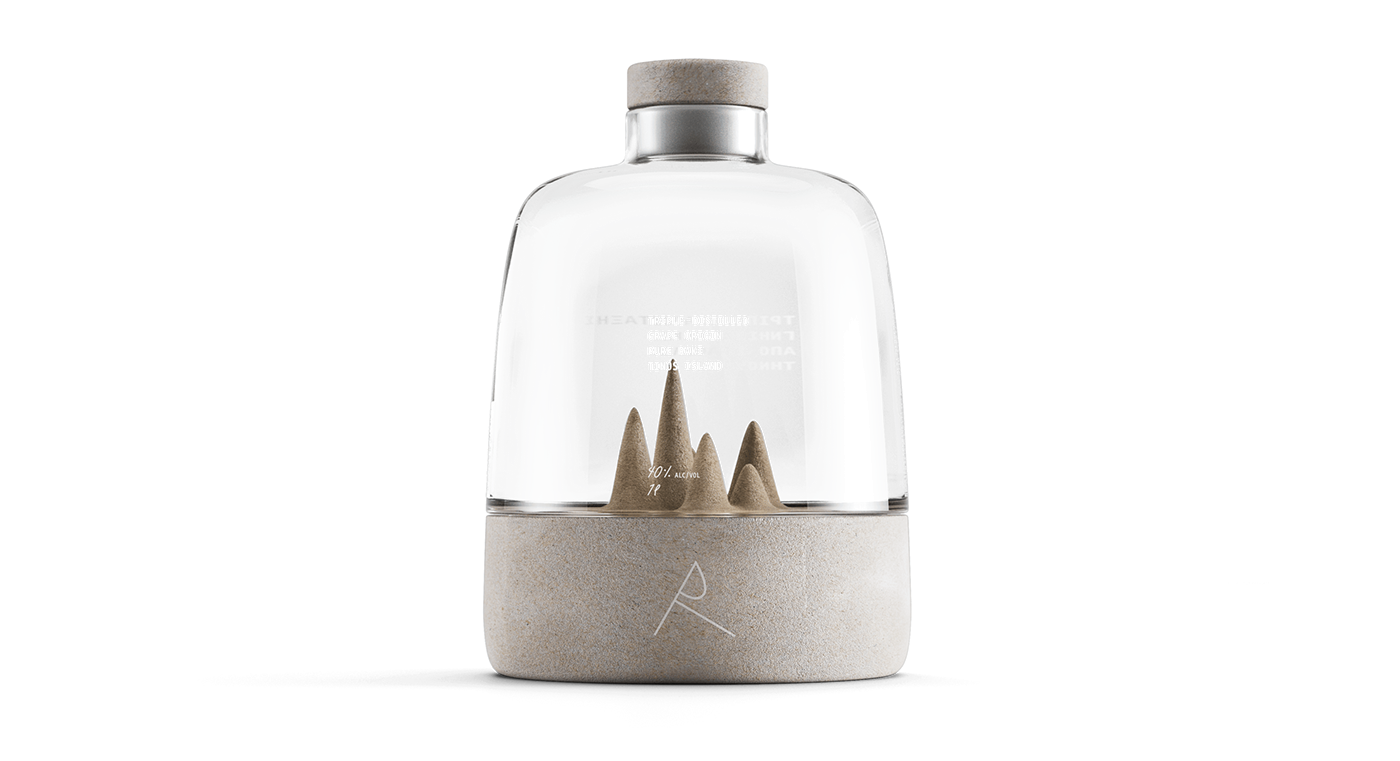
Raki
For this alcoholic beverage we came up with a premium bottling experience.Through extensive research in distillation we schematically depict the process of converting solid matter (grapes) into gaseous form and then liquid.
Such a concept is derived from the use of a compostable sugar cane base material which has an upward tendency through fluctuations to the transparent beverage container material.
In this emphatic design we aimed at a simple typographic rendition, that would be coherent throughout the product range.

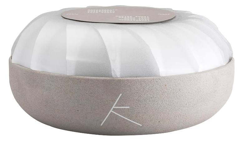
Artichokes in olive oil
A combination of two materials was a paramount principle for the artichoke packaging. This decision appears cohesively throughout this visual identity.
The embossed shape in the pot’s lid is a direct reference to artichoke itself.
The strainer, a surface that separates the olive oil from the artichokes keeping them afloat was also a solution we came up with during the brainstorming phase.


Kalathaki cheese
The idea for kalathaki cheese is found in the very process of its production, the traditional basket of Tinos.
The packaging is a combination of a special wrapping with rice paper, with a shape that is reminiscent of a shell, emitting a sense of purity and order.
Τhe remaining design decisions fall in line with the rest of the identity’s essential ideas.

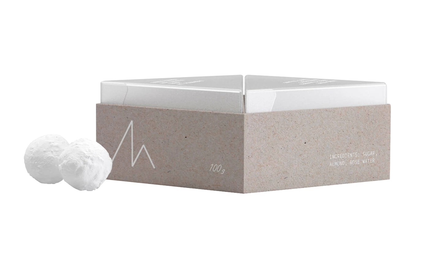
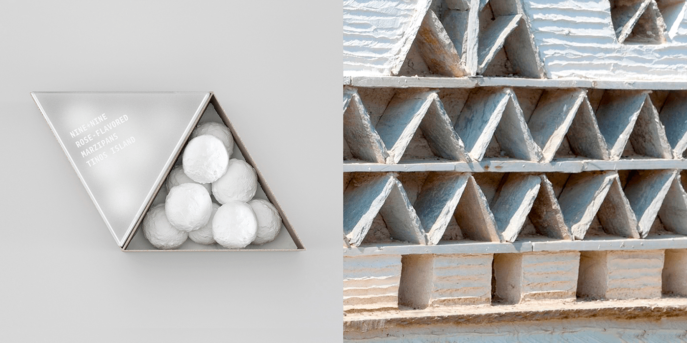
Marzipans
Tinos marzipans’ concept was to have a small packaging with reference to the characteristic pigeon houses found extensively across the Island, meanwhile enabling multiple packagings to form a larger gift box together.
The materials selected were be-pulp and thick rice paper.
Lasagne
Τhe fundamental idea for packaging lasagne came from the very way of producing the hand-made pasta.
Thus, on the packaging, we placed the drying stick of the pasta in relief and the window-cutter in the shape of the hanging pasta.
Αpart of being an aesthetic reference, we have found that the embossed stick at the top of the triangular packaging also functions well as a small grip, which adds to the consumer’s haptic experience with the product.


Typography
To complement the visual identity we also designed a custom typeface specifically for this project.
This typeface derives from ancient and Archaic writings that can be found in different historic relics of Tinos.
While containing a strong heritage, it also varies in contemporary geometry to create and promote a fresh look that bonds well together with the rest of the series’ concept.


created by
brand.new


